Friday 19 June 2015

culminating

In art we watched a video about stealing art and ideas. The idea of this video actually shows how stealing art isn't something new, but has been practiced since the beginning of time. We as humans need to steal other peoples ideas in order to find our style. Many people see it as unoriginal, stealing peoples art and even their styles. I think this is unbelievable because art is something that needs to be copied to find new styles.

The people complaining see this as stealing and think that the people doing it should be punished. But aren't we all guilty of copying others ideas. I am for sure, and especially in my art. I take someones idea and use it in one of my pieces. Even famous artists are guilty of this as well. It just happens that someone takes an idea, improves on it, and makes it their style. Da Vinci wasn't the first to paint a portrait, Van Gogh wasn't the first to use oils, it just happened they were good at it.

There is a line that needs to be met which is taking someones art and not giving the artist credit for it. People have taken photos of people's art and posted them online and didn't give any credit to the artist of that piece. They end up making money of a of a photo and the artist gets the short end of the stick. This in my opinion is downright wrong and is stealing in my opinion. I understand taking an idea and crediting the artist but when you try and claim a piece as yours... There needs to be something done.

Another thing people have done is, is taking a piece and adding something to it. They still give credit to the original piece but do there own thing. Critics find this outrageous as it is seen as ruining someone's work. The L.H.O.O.Q. by Marcel Duchamp, has been known to this controversy. He took a Mona Lisa print and added a gouty.  Critics hated it as it ruined the Mona Lisa and blamed him for it. He made this piece in 1919 and it drove people mad. But in 1883, artist Eugene Bataille made La Rire. A print of the Mona Lisa with a pipe in her mouth.                                      So this idea of "ruining" art was around before                                        Duchamp. Also the artists credited Da Vinci and                                      the piece itself.


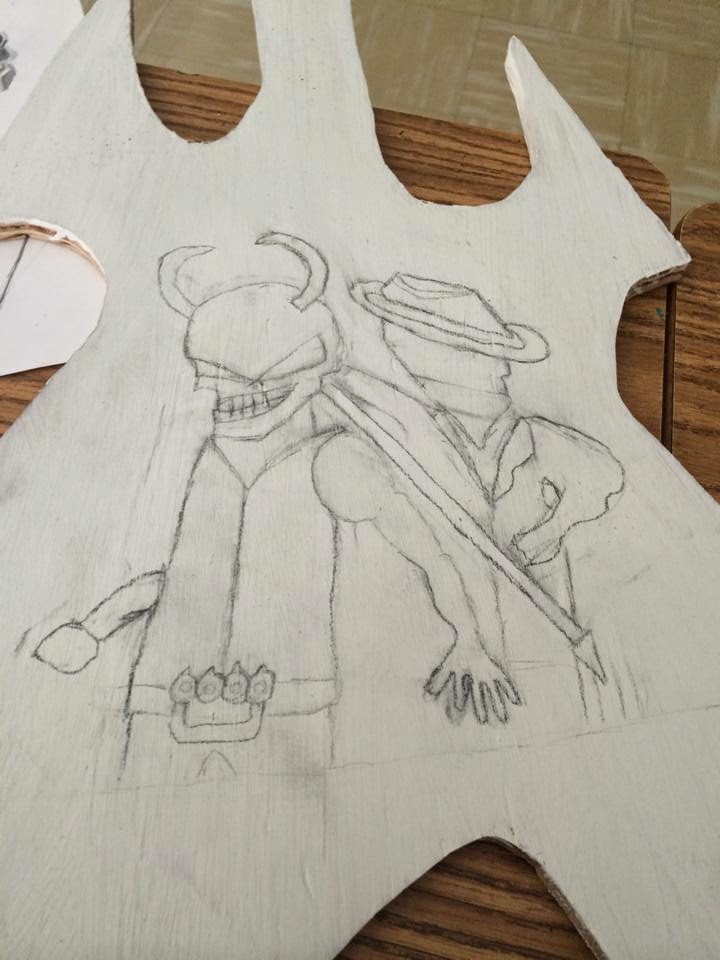
Art is very controversial. Especially when people don't understand that art is something that is stolen, reused, and mimicked. This is how artists improve and make pieces. Sometimes people go to far and completely take another's piece for themselves. The way people must look at it is, when you put something such as an art piece into the media, you do not own it anymore. It is the public's.

Monday 1 June 2015


I finished my Jim Root mask from Slipknot. This is a comparison to one of his actual masks. I didn't put the eyes in as it ruined the plaster. I used my own creativity for the masks as that's what the members of Slipknot do when they design their own.

Thursday 28 May 2015

I have my Jim Root mask started for the other part of my series. Jim Root is one of the guitarists from Slipknot. The band all wears different masks and they tend to switch up designs of their masks every few years. Their masks are personal to them and represents their character. I decided to make Jim Roots mask as he is my favourite member. I used my own idea fort the paint effect on the mask. I still have to add a few more features but it is coming along.

Monday 25 May 2015

 Last week I got to be apart of a discussion with the Director of Education, Dave Tamblyn. We discussed the way we learn, how to accept the aspect of failing, and how to improve on our failures. Mr. Tamblyn was very open to our conversations and opinions and really paid attention to what we said. He even gave great feedback to us. He said we could make a video presentation that he would show at a later meeting. We all felt very comfortable bringing up certain topics and it was a good experience for us to talk to a high powered person in the education system. I'm really excited to do these presentations with Jory, Kayla, and Sierra. We are all very excited to do this as it feels we will finally have our words heard.

Monday 11 May 2015

Course Culminating

In art for our culminating I thought we could do a piece of work and go into groups of two after and critically analyze the pieces. We have practiced critical analyzing throughout this semester and this would be a good way of showing how we have learned how to do it. We could analyze each others work to show that we know how to apply it. We could do a painting or something and have a due date and after the due date, break off into groups and discuss the pieces.

Friday 8 May 2015

teacher's learing

We started in class with a new little podcast that we have been doing each day so far. Mrs. Rose has been learning how to play guitar and it is really fun being able to help her like she helps us. It is a learning and teaching experience for everyone as we are all helping each other and earning from each other. I hope we get to do more as it is a lot of fun too do.

Monday 4 May 2015


I tried out the cubism page through Doug Peterson's page and had tons of fun with it. I like how you can take a nice looking picture, distort it and make more beauty out of it. It is so simple yet so different and interesting. I think it is a great idea and I had fun with it and think that you can make really interesting art with it.

Friday 1 May 2015


After a lot of changes and procrastinating I finally finished my guitar. It took many different shapes and changes but I like the outcome of it. I took the design of Volbeat's skull design added my own twist. I used a toothpick to do the dots on the bandanna. My lines have greatly improved on this and they turned out really well.

Wednesday 29 April 2015

We looked at one of Mrs. Rose's friends Doug Peterson who is a former teacher and who has made it easier to access and website to try pointism. I've tried it on another site before and it was really fun to do. I like how it distorts an original image into something different. It takes something so natural and does something different. It is a lot of fun to do and really can bring out more beauty in an image

Monday 20 April 2015

Scratch & Mix Project

The Scratch & Mix Project is a great and meaningful idea. I think it is great to reflect on the African-Canadian youths and their cultures through their own expressions of art. I think it also great that they will get to have their pieces on an exhibit in Ontario's Art Gallery in Toronto. It is nice to see what these people are doing and some of the culture aspects to their pieces. It would be cool to see these exhibits in person but for now I have pictures and videos to see.

Wednesday 11 March 2015

Pop Art

Pop Art is one of my favourite art styles. I like how artists took many things famous in pop culture and turned them into very nice pieces of art. Pop art is similar to data as it references pop culture. Pop Art originated in the US and the UK in the mid 1950s. In the US the art was seen with very hard edges and were prominent. Irony and parodies were often used to make the art. In the UK, pop art was seen much softer but still included the ironic and parody themes. Andy Warhol was one of the most famous pop artists. He did the Campbell's soup can. He also did many paintings of celebrities and included different contrasts with in the painting. His most famous and my personal favourite is of Maryann Monroe. The contrast of the colour really shows how the art style of the 50s and 60s. I really like this painting and enjoy the beauty of  the altered reality of it.


In the UK an group called the Independent Group was formed to reflect on the Pop Art form. Young painters, and sculptures, and many other artists formed together to create magnificent forms of art. They looked at many pop culture references and designed pieces around them that were later looked at by critics to be judged.

Many people did not think Pop Art was a form of art as it just took simple things and created paintings. It was much similar to when DADA Art came out and people did not believe it was art. Many thought it did not hold up with many pieces and would not be remembered in years to come. But they were proven wrong.

Pop Art took a major turn and started being used as designs for propaganda. It is widely used today for the effective colours and designs as it is something different. Che Guevara had one of the most famous ones during the Cuban Revolution. It was very simple but had a deep message behind it. Often times as well many pieces were seen warning of the "Nuclear War" as this was during the Cold War and there was always a fear of the Communists sending a Nuclear Bomb over to America. Often times it was a battle of who had the best form of art instead of the best weapons. It was also used to boost confidence of the troops and persuade them to join the fight during Vietnam. The most famous piece of propaganda in American history has to be the Uncle Sam poster, calling "you" to duty.


I think Pop Art is amazing and a large part of art history in the 20th Century. They seem so simple but do so much. They may not seem very complex but with the angles, shading and forming the colours there is a challenge behind it. It has become a part of our culture and I think it will live on forever.

Monday 9 March 2015

Feathers of Hope

The Feathers of Hope documentary seems very powerful and meaningful. I think it is good that they are really bringing the racism to the light. It is often seen that Canada is very accepting for it's multi-culture country. But there is a lot of negative opinions towards the aboriginal people just like the African Americans in the United States.  It was very emotional just watching the trailer for it because the people in it seem so hurt and it really makes me look at what Canada has become over time with negative history. I will take time to watch the documentary because it seems very powerful. Especially living in Northern Ontario as it is so Abrigional dominate but it is also the centre of a lot of the racism.

Friday 6 March 2015

Project part 1


In art right now I am working on a project for the 3 pieces that will be related. I decided to do a cut out of my guitar and paint a mural on it. It is going to be of my 2 favourite bands, Five Finger Death Punch and Volbeat. They did a tour together and I am using that poster design from it to incorporate it into it. I used my guitar design on wood for the canvas because I love to listen and make music.

Friday 27 February 2015

My sketch


This is my newest sketch. It is the draft for an art project I am working on.It is based off of the poster for Volbeat and Five Finger Death Punch's tour they had together. I drew it on to the the shape of the body of my guitar. I couldn't get one of the faces done because it was to hard. I tried but it was a harder face. I plan on doing this on a large piece of wood shaped like a guitar.

Monday 23 February 2015

My three art pieces

For my three main art pieces I plan on using music a big inspiration for it. Music is a big part of my life. I love listening to it and even making it. I like all kinds of music genres but my main genre I enjoy is anything in the rock genre and metal. I like to play my guitar at home and even right songs. I find it very relaxing. Listening to music has always helped me. It helps keep me in a clear mind set and helps me stay on track. I really want to use my love of music and turn it into art pieces. I want to put all of my passion into it. I would like to incorporate things from my favourite artists and songs by them. It could be lyrics and a piece inspired by an album art or their instruments. Some of my favourite artists consist of Volbeat, Five Finger Death Punch, Iron Maiden, Theory of a Deadman, Black Label Society, and so many more that the list would be endless. One cool thing Volbeat incorporates into their album arts is that some of them are painted. They are done up really well and look nice to me. Five Finger Death Punch does a similar thing but also has a consistent character for their albums.

Friday 20 February 2015


My newest sketch has taken inspiration of one of my favourite movies Drive. He is a mechanic and stunt driver for movies by day and is a professional driver for criminals at night. He lives a double life and is trying to become good when a meets a girl and her son and cares for them. He has troubles though as one life has more of an impact. The movie has a lot of meaning to me and I consider it one of the best movies I have seen. I saw that it could be a good thing to use for a drawing for juxtaposition has he has two polar opposite mind sets. I used him in the centre of the page as the "I" for the word "DRIVE" which is the title of the movie. I really focused on the lines and showing his two different sides.

Tuesday 17 February 2015

Film Review

I watched the short film, High Desert Test Sites. It was about people retreating to the desert for new experience. It focused on a resort for elderly people and different pieces of art that people are doing in the desert. The video wasn't very focused but it was interesting. The art pieces it showed were very interesting and eye catching. One that caught my eye was of the lady who appeared to be vacuuming a carpet. It was all real props and a real woman, standing in that position. It was very interesting to see that as it brought a feeling of a home into the middle of the desert. Juxtaposition was the theme of that as it took two different aspects and put them together. The rest of the pieces were also interesting too but that one caught my eye. The video felt like it took a topic and just briefly touched on it and left it. I didn't like that about it. I didn't understand some of the video even though I watched it three times.

Friday 13 February 2015


This is my second sketch I have done. It is an eye with the sun in the middle. I tried to do my best on it but I am not that good when it comes to drawing things to scale, but I like to draw eyes. I think they tell the most story from a humans body as they show great expressions. Eyes are always different and are unique to everyone. They show great beauty and I would love to improve my skills on drawing them.

Monday 9 February 2015

Elements of Art

The elements of art consist of'; Shape, Form, Value, Line, Colour, Space, and Texture. All of these elements combine make a strong art piece.

Shape


Shape is seen in this piece of all of the designs made to fit inside of the body and neck of the guitar. It helps give the piece an abstract feel. Each shape is different but definitive in its own way. If you look closely at the image, other guitars are formed by the shapes.

Form


The form in this piece is seen very clearly. It is painted on a flat surface but depth can be seen from the eye itself and the eyelid and lashes. The lashes feel like they are popping of the painting at you as the eye feels like it is set back in the wall, connected with it. 

Value


Value is seen in this piece as the light and dark is clearly defined. The grass under the tigers feet and back drop of the dense jungle is clearly separated as the jungle is shaded very dark to show the density. Even the bull under the tiger is shaded darker as the shadow of the tiger covers it. Each stripe on the tiger as well is clearly defined with some dark ones being darker to show age in the tiger. 

Line


Lines in this piece are seen all over it. They are what make up the design of Batman and the Joker next to each other. On Batman the lines are seen more dense and straight almost representing a more proper look as with the Joker they are a bit more spaced in areas and have more of a curve representing the more darker tone. 

Colour


Colour in art helps develop what the viewer sees. We all see colour differently but the shades and tones are always the same. In this piece the brighter tones almost give off a sign of mystery even though the colours seem inviting. The tone and the way they are placed shows another story, but it may be different for someone else who is viewing this.

Space


This one of the most common designs seen when dealing with space. The negative and positive space are clearly represented. In one there appears to be a vase but in the other it is two people looking at each other. The facial features make up the outline of the vase right? Or does the outline of the vase make the facial features. That is the beauty of space, when it is used right it can create something completely different. 

Texture


This is a digital rendering of Mercury. Nothing fancy right? Well I bet just looking at it you can feel the rocky terrain on your finger tips, the crumble of the gravel and dried rock on your hands. Texture is seen very prominent in 3D art and renderings. They help give a feel to the piece and make it feel like you are actually looking at something that is there and at any given moment you could be actually touching it.

Friday 6 February 2015


This my first sketch I made for second period art. I took a simple design I use to make as a kid and expanded on it with more of a psychedelic vibe. I darkened the lines and experimented with different designs before making the final touches.

Tuesday 27 January 2015

Examples of Graffiti


The artist for this graffiti art is unknown. The Joker is a popularized character in Batman and was featured in the 2008 film The Dark Knight and was portrayed by Heath Leger. He was a villain who went against the system and wanted to corrupt anything helping it. Viewers seen this and use him as a face for them being against the government and what is going on like wars and other issues that they feel the government should of kept away from.


This is another piece done by an anonymous group. When George W. Bush was in power in the United States, people thought that the acts he was doing was not right. They felt that he was an unfit president and was letting the middle and low class of the United States fall before him. They thought he completely disregarded them and only cared about the ones who were bigger contributions the government. They also felt that he was not a man of peace and was ready to start a war with any country that had resources that Bush thought America needed.


This final piece is also by an unknown artist. It is a representation of what has been going on in Northern Ireland for many years. Britain has occupied Northern Ireland and made it part of them and small militia forces formed together and formed the IRA (Irish Republican Army) to rebel against the British in order to gain control of Northern Ireland once again. They have been known to do some cruel and unusual things and have now been considered terrorist but they still want to regain power over Northern Ireland. Many natives to Ireland have backed the IRA but don't engage in war being waged. Instead they express their opinions in art and one example is graffiti. This one shows what IRA stands for but it has gotten questionable over the years.

Wednesday 21 January 2015

Culminating

listen to ‘Bordie -- Contemporary Art’ on audioBoom
I feel that contemporary art is an expression of a time. It allows people to express what they see in the times they live in through art. Things from politics to wars and natural disasters are all things artists focus on when making their finished piece. It might not show it at first but when looking at the art and hearing the story, you begin to see what the artist imagines. 

Friday 16 January 2015

Our class has done more to collaborate with Japan. We received a parcel with treats, post cards, photos, and best of all; a mural our class will be working on. It shows Japans' culture as our theme is legacy. It is amazing to see to classes separated by so much, be connected through the power of art. Our class has decided to show our legacy of nature and aboriginal descents on our side. It already looks amazing thanks to the effort the artists have put in. We also plan to return the favour of treats and trinkets when we return the mural to Japan. It is very fun to do this and also very interesting.